AMH · Property maintenance operations · 3 months · 2023
Designing dispatch around decisions, not empty calendar slots
Client context. AMH (American Homes) is one of the largest single-family rental operators in the US, managing roughly 55,000 homes at the time of this project. Its operations team needed a clearer way to schedule maintenance work across markets.
The existing experience made it possible to place work onto a schedule. The harder question was whether an assignment actually made operational sense. A technician could have free time and still be the wrong choice because of location, workload, route impact, service constraints or the shape of their existing day.
I led the UX work across research synthesis, workflow definition, wireframes, user flows, the map-and-timeline interaction model, and moderated evaluation of the working product.
The resulting direction brought the information needed to assess an assignment into one scheduling workspace — before work was committed to the field.
- Role
- Product Designer — workflow definition, research synthesis, interaction model, wireframes, user flows, evaluative testing synthesis
- Problem type
- Operational decision support
- Scale
- 1,300 technicians · 55,000 properties · multi-market operation
- Outcome
- Route-aware dispatch workspace with clearer assignment context before commitment
01 The brief was scheduling. The problem was decision quality.
The original brief could easily have become a calendar redesign.
But placing work into an empty slot wasn’t the difficult part.

Is this technician actually a sensible person to assign this work to, at this point in their day?
A workable assignment depended on more than capacity — route, priority, service constraints and the shape of the technician’s existing day also mattered.
I worked alongside a subject-matter expert to understand how those factors shaped real scheduling decisions and what the first concept needed to represent.
But expertise by proxy could only take us so far. Once the concept was coherent enough to challenge, I put the working design in front of an experienced Field Manager.
Put enough operational context around the decision for a Field Manager to judge an assignment before committing it.
View the operational risk behind the problemExpandCollapse
- Dispatchers had to combine system data, manual scanning, and local market knowledge before committing assignments.
- Poor scheduling could create inefficient routes, overloaded technicians, missed service windows, resident frustration, and manual rework.
- Local geographic knowledge lived in a few veteran heads, creating key-person risk for a multi-market operation.
- The product needed to make more of the decision logic visible and repeatable before work was sent to the field.
02 The decision model
The key user action was scheduling a work order, but the real decision was more complex: Should this technician take this work order at this time?
Empty slots aren’t enough
Field Managers needed four signals to judge whether work actually fitted a technician’s day.
Is there usable time?
Workload and non-work commitments
Does the journey make sense?
Technician location and travel impact
What should be acted on first?
Urgency and ageing work
When can the work happen?
Resident and appointment context
Assignment fit
Right technician + right work + right point in the day
Research synthesis
03 What the evidence changed
I combined workflow analysis, operational input and later evaluation of the working product to understand what Field Managers actually needed at the point of assignment.
The important findings weren't isolated usability issues. They changed what the scheduling product needed to represent.
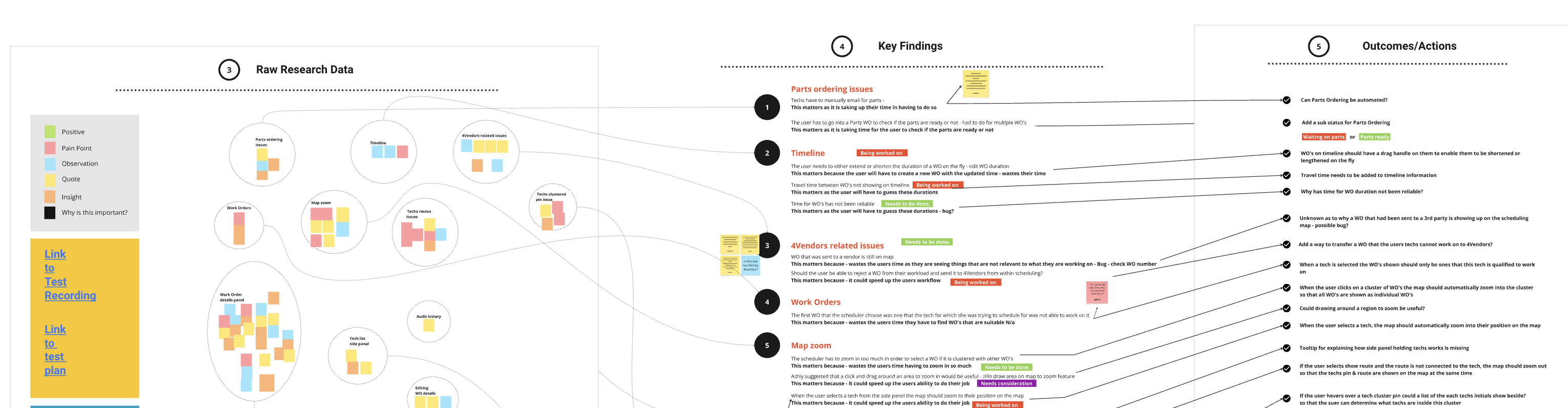
Capacity
Empty calendar space didn't represent the full shape of a technician's day.Represent workload and non-work commitments.
Geography
Location and travel affected whether work fitted into a technician's day.Bring map and timeline together.
Priority
Urgent and ageing work could disappear inside a large unscheduled queue.Surface work by operational importance.
Context
Important service and work-order information depended on local knowledge.Bring work, technician and route context together.
Commitment
A poor assignment could still be committed quickly.Add a review step before final commitment.
Direct access to operational users was limited. Rather than presenting the research as broad validation, I treated it as evidence for reducing specific uncertainties and used a later moderated session with an experienced user to challenge the working design.
04 Four iterations: from map controls to a dual-view workspace
I worked the concept through four rounds of hand sketches before committing to higher fidelity. Each round resolved a different layer of the problem — first which layers the map should carry and let you toggle, then a second view and capacity, then the core interactions, and finally the structure that shipped.
The first round put everything on the map at once: technicians, work orders and routes. That exposed the problem straight away — drawn together, the layers became noise. The first real decision wasn't a layout but a control. Each layer became something the scheduler could show or hide.
Three decisions shaped the product
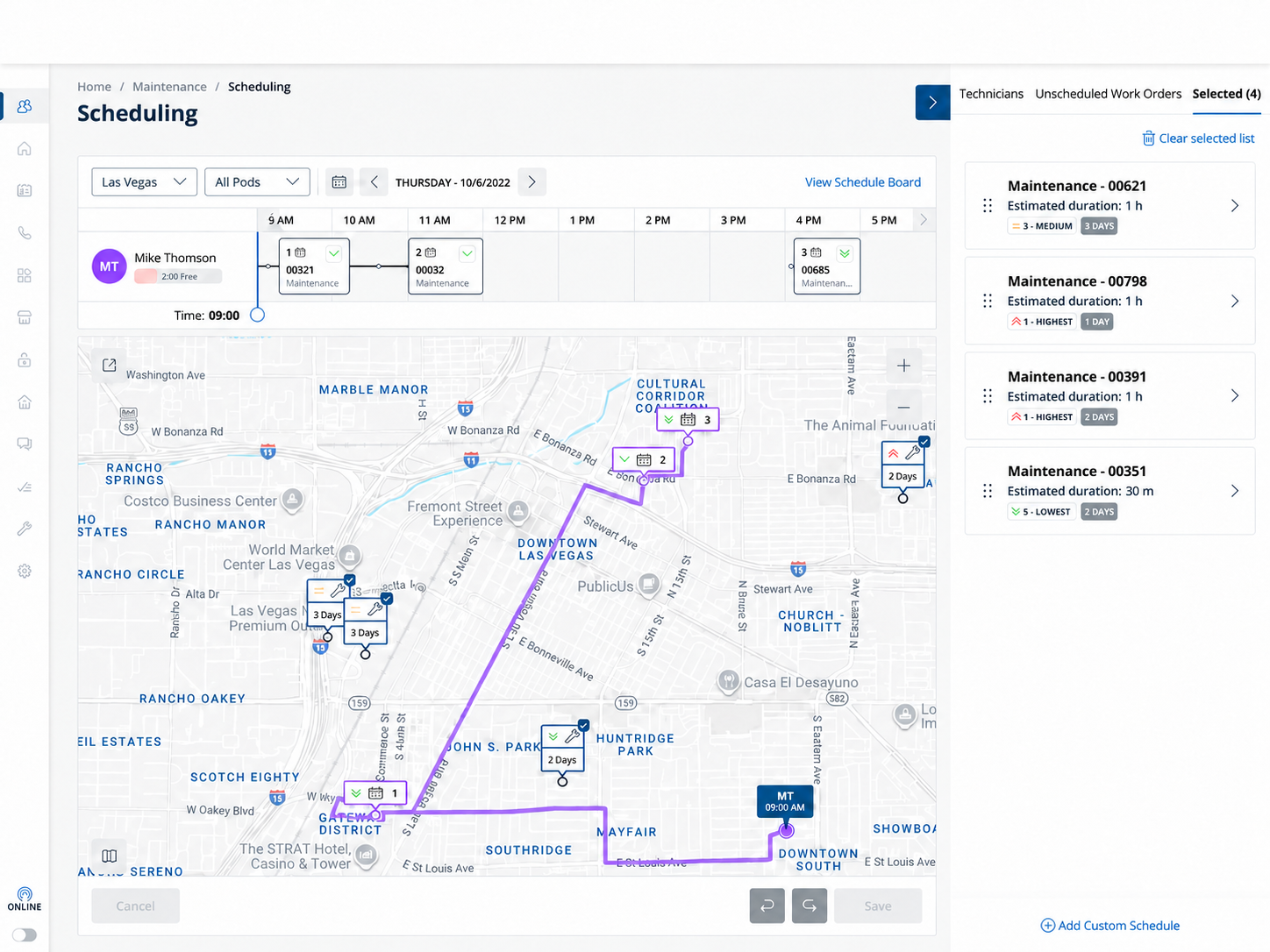
Put geography and time in the same decision space
The existing scheduling model treated time as the primary organising principle, even though the work itself happened across a large geographic area.
A timeline could show that a technician had space. A map could show where the technician and property were. Neither, independently, answered whether the assignment fitted the technician's day.
I brought the two together.
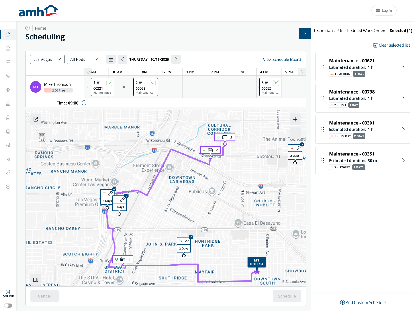
The timeline made workload and sequence visible while the map exposed the geographic consequence of the same decision. Selecting a technician or work order therefore changed both views of the problem at once.
The trade-off was greater information density. The benefit was that the user no longer had to mentally reconcile time and place across separate contexts.
05 Decision 02 — Narrow the work before judging the fit
Field Managers weren't choosing from a handful of jobs. In a market like Las Vegas, the unscheduled queue could contain more than a thousand work orders.
I designed the workflow so they could first narrow that queue using operational criteria such as priority, work type, status and duration, then assess the remaining work against the technician's existing workload and route.
The aim was to move from “What work is waiting?” to “What work realistically fits this technician's day?”
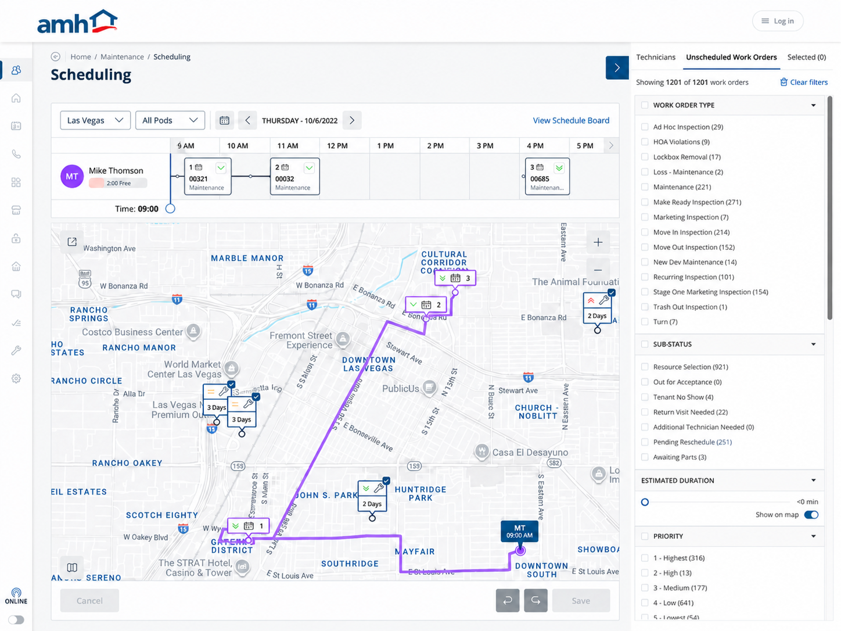
Work type, status, duration and priority reduce the candidate queue.
Workload, sequence and travel reveal the usable shape of the technician's day.
06 Decision 03 — Let people move quickly, but slow down the commitment
Field scheduling is high-volume work. Adding confirmation to every small interaction would make the product frustrating.
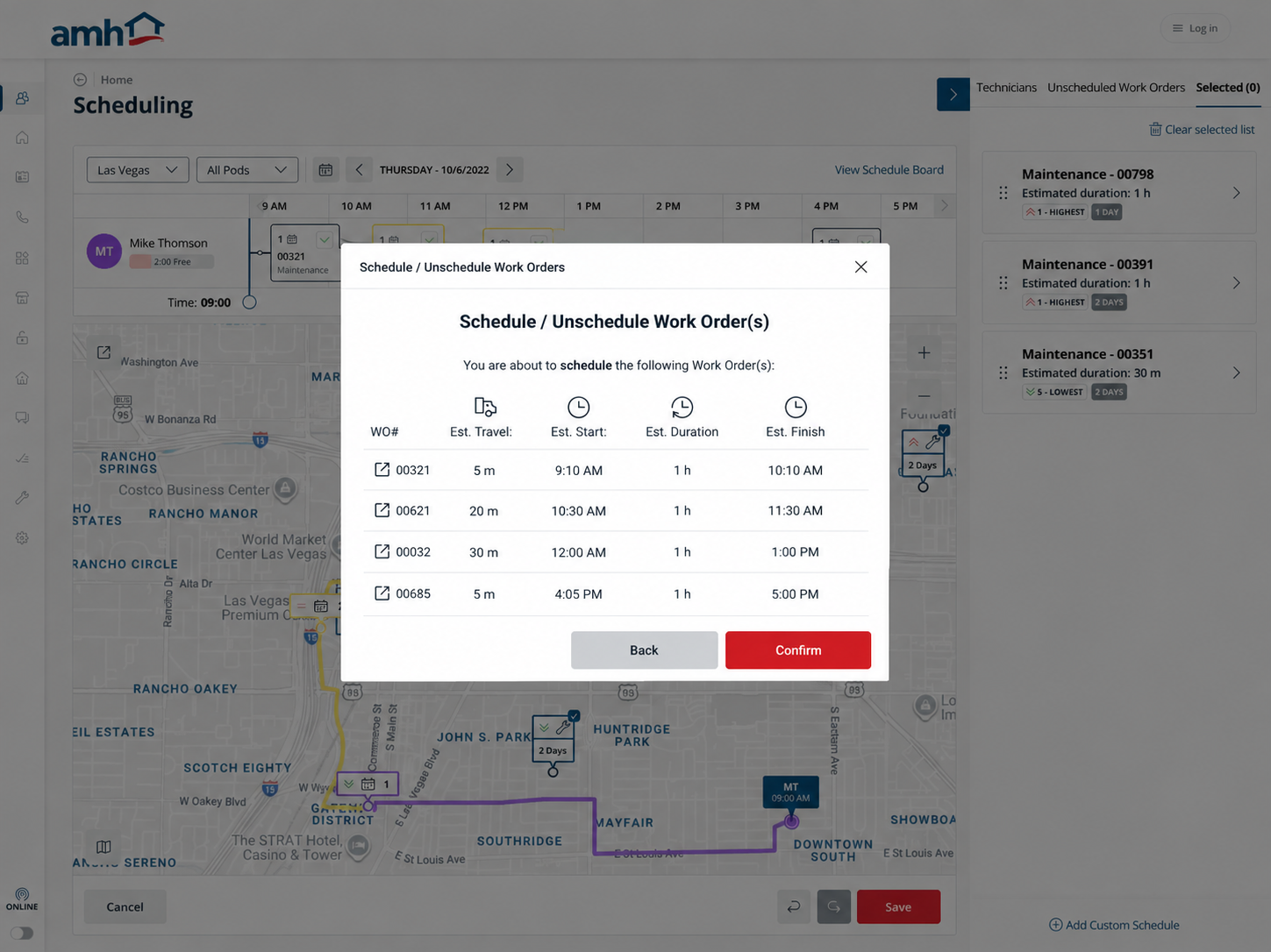
But allowing a drag-and-drop action to immediately commit a consequential assignment created the opposite problem: speed without enough visibility into what had just changed.
I therefore treated scheduling as a staged commitment.
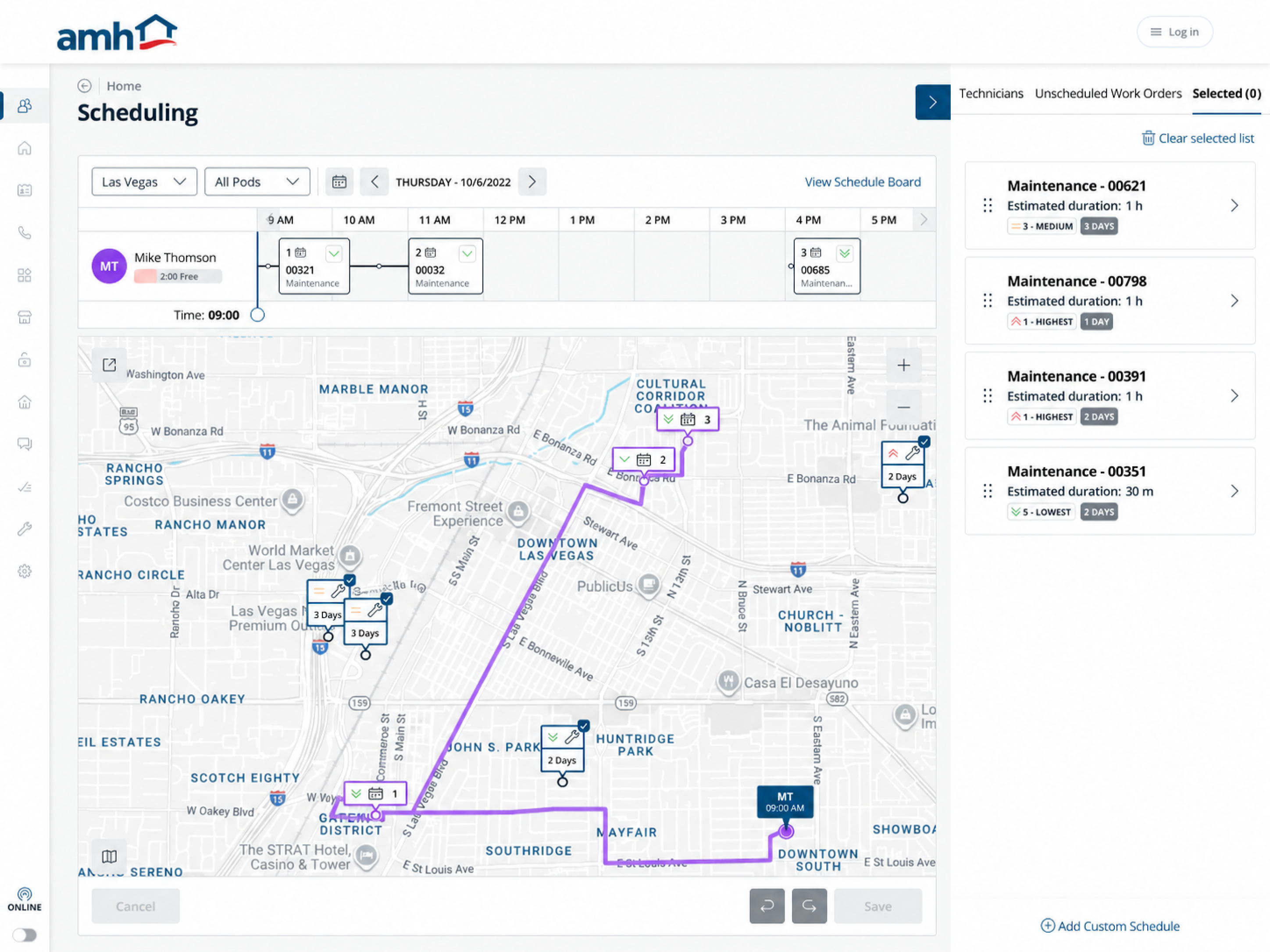
Field Managers could explore, filter, select and position work quickly. Before the assignment became final, the interface exposed the information most relevant to the consequence: technician, work order, travel, start time, duration and resulting finish.
The extra step introduced deliberate friction — but only at the point where the cost of a mistake became meaningful.
07 Engineering changed the question
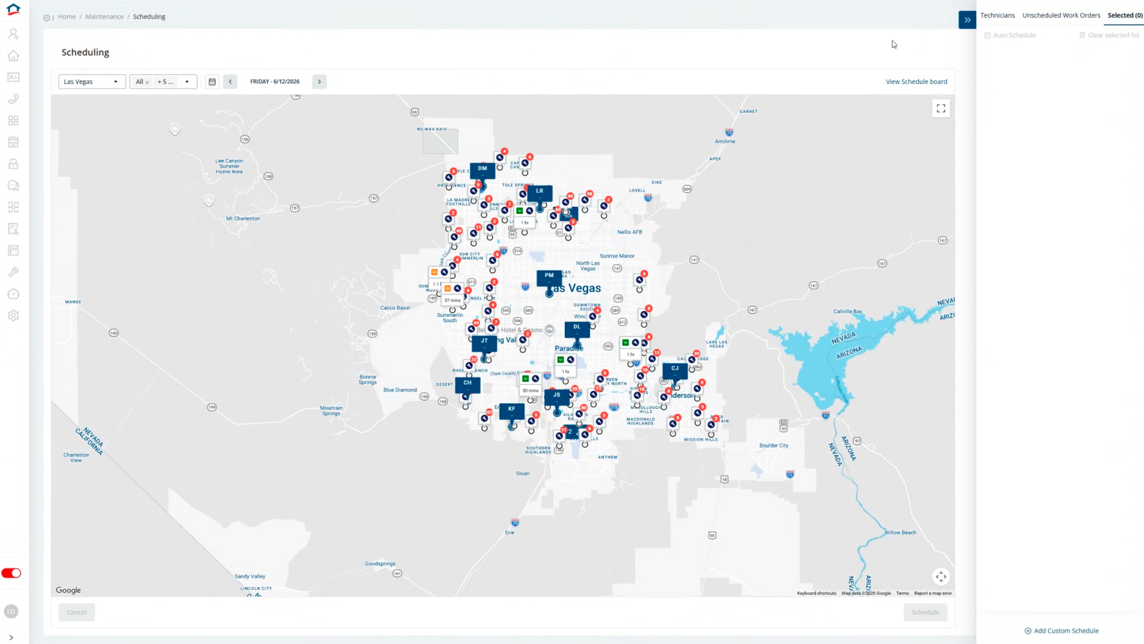
My early concepts showed every technician's route simultaneously.
Conceptually, that made sense: if route visibility was important, showing all routes appeared to provide the most information.
Engineering exposed the cost of that assumption.
Every rendered route required a routing-API request, recalculated as schedules changed. Repeating that across multiple technicians and markets would compound into meaningful operating cost.
Instead of asking “How can we preserve every route?”, I went back to the decision itself.
Field Managers needed to compare the positions of many technicians, but they only needed detailed route information for the technician they were seriously considering.
The model therefore became:
Location pins for everyone; calculated route for the selected technician.
We gave up simultaneous route comparison, reduced unnecessary API usage and also reduced map clutter.
Later evaluation supported the simplification: once a technician was selected, the participant wanted the remaining technicians removed from view altogether.
Selected user flows
Beyond the primary scheduling walkthrough, three more flows carry the product logic.
Adjust a work order’s timeExpandCollapse
Field Managers could reposition work on the timeline while keeping its effect on workload, sequence and travel visible.
Undo schedule changesExpandCollapse
Undo kept schedule changes reversible, allowing Field Managers to explore a better sequence before committing the revised day.
Create a custom schedule block with locationExpandCollapse
Non-work commitments could be added with a location so the timeline and route reflected the technician’s real day, not only assigned work orders.
08 What changed, and what would come next
The work shifted the product from a calendar-first scheduler into a route-aware dispatch workspace.
Assignment decisions became clearer because dispatchers could see capacity, location, route impact, priority, and service constraints before work was committed.
The workflow shifted from calendar-first scheduling to route-aware dispatch decision support.
Dispatchers had clearer capacity, route, priority, and service context before assigning work.
The workflow reduced ambiguity before high-consequence assignments and created a repeatable scheduling model across markets.
What I would measure nextExpandCollapse
- Median time to schedule and creation-to-assignment time
- Reschedule, reassignment, missed-appointment, and double-booking rates
- Average travel time, mileage, route density, and technician utilisation
- Backlog age, priority counts, jobs per technician per day, and schedule gaps
- Filter usage, drag-and-drop completion, confirmation abandonment, map load time, and route rendering performance
What I would improve nextExpandCollapse
- Return-visit creation and recovery flows for rescheduling, cancellation, reassignment, and missed-appointment follow-up
- Service-window warnings, live status instead of manual refresh, and automated resident notification
- Better map legibility at scale, clearer technician clustering, and clearer work-order markers
- Keyboard-accessible scheduling actions and non-colour-only priority indicators
- Rule-based or AI-assisted recommendations that support dispatcher judgement without removing control
- Stronger production measurement around scheduling speed, route efficiency, utilisation, backlog health, and usability