Accessibility is often treated as something that happens at the end of a project. A checklist before launch. A compliance review. A set of issues to fix once the “real” design work is done.
That mindset is the problem.
Digital accessibility is not just a legal requirement or a technical standard. It is a way of designing products that more people can use, with less friction, more independence, and fewer unnecessary barriers.
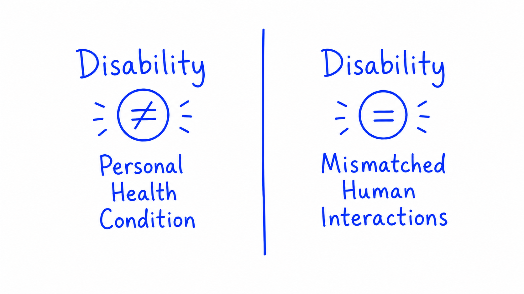
A useful way to reframe accessibility is through the social model of disability. Disability is not only about a person’s condition. It is often created by a mismatch between a person and the environment around them. A wheelchair user is disabled by a building with no ramp. A blind user is disabled by a website that does not work with a screen reader. In both cases, the barrier is designed into the environment.
That matters because digital products are environments too. Every inaccessible form, unclear label, low-contrast interface, empty button, keyboard trap, or poorly structured page creates friction that did not need to exist.
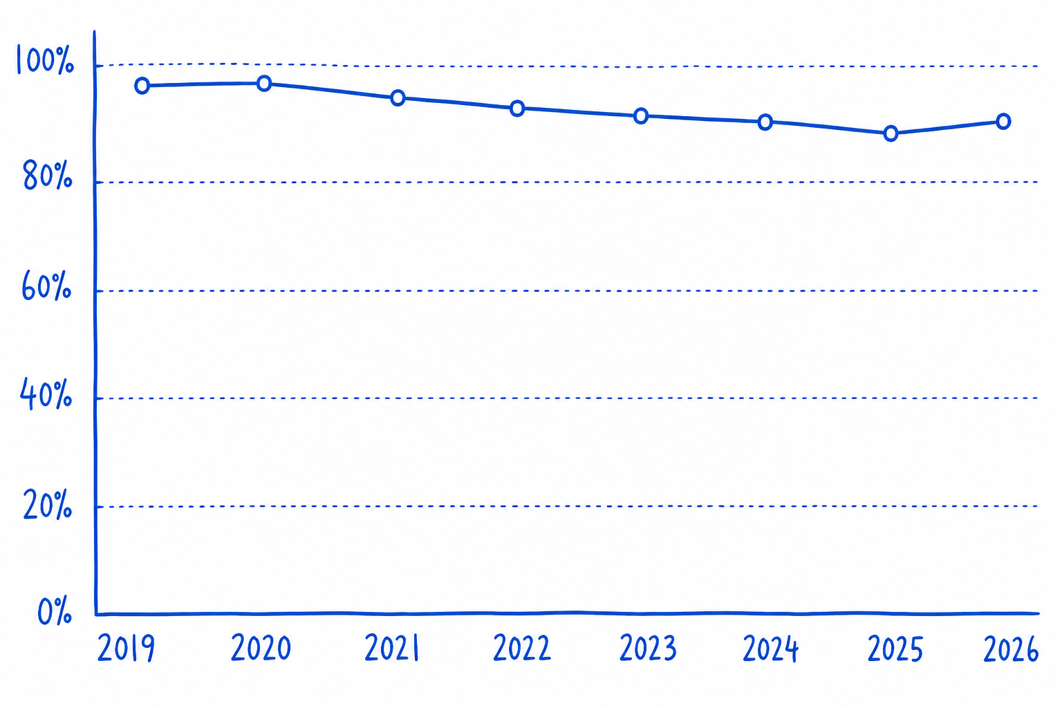
The scale of the problem is still significant. WebAIM’s 2026 Million report found that 95.9% of the top one million home pages had detected WCAG failures. That does not mean automated testing can identify every barrier, but it does show how common basic accessibility issues remain across the web.
The frustrating part is that many of these issues are avoidable. The EAA Action Pack focuses on common problems like insufficient colour contrast, missing alt text, missing form labels, empty links and buttons, poor structure, focus visibility, target size, dragging alternatives, redundant entry, and accessible authentication. These are not exotic edge cases. They are product quality issues that can be addressed early through better design, content, development, and QA habits.
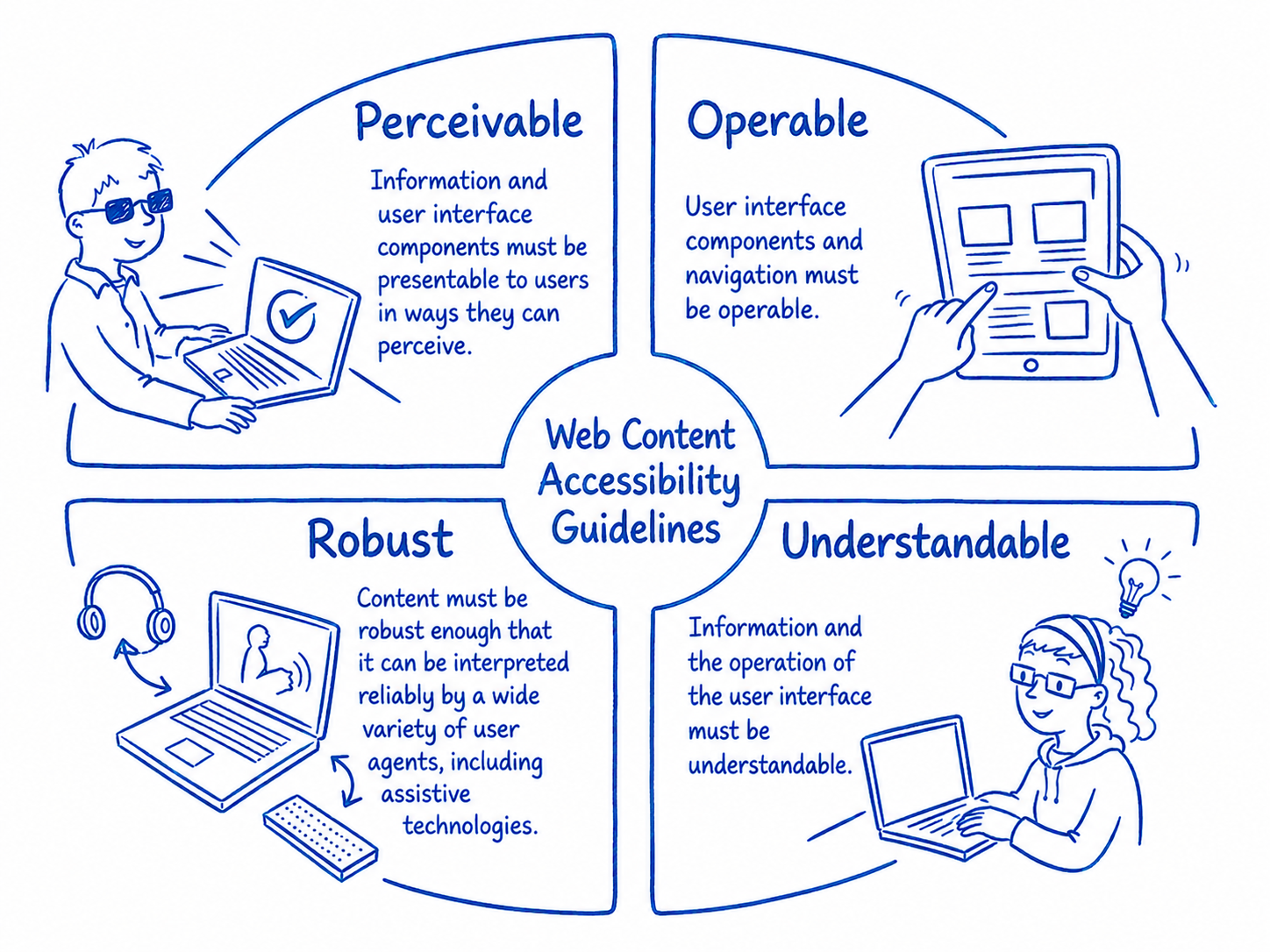
WCAG gives teams a shared language for this work. Its four principles — Perceivable, Operable, Understandable, and Robust — are a simple way to ask better questions. Can users perceive the content? Can they operate the interface? Can they understand what is happening? Will it work reliably with different devices, browsers, and assistive technologies?
For many organisations, WCAG 2.1 AA remains the practical baseline through EN 301 549, while WCAG 2.2 is the smarter design target because it adds nine additional success criteria and strengthens support for people with cognitive, visual, and motor disabilities, particularly in mobile and interaction-heavy experiences. W3C also notes that content meeting WCAG 2.2 meets WCAG 2.1 and WCAG 2.0, which makes designing to the newer standard a sensible forward-looking move.
The European Accessibility Act has made this more urgent. It sets EU-wide accessibility requirements for certain products and services, and national measures began applying from 28 June 2025. For teams providing covered digital products or services into the EU market, accessibility now has a clearer regulatory dimension as well as a user experience one. Organisations should verify their own obligations, but the direction is obvious: accessibility can no longer sit outside normal product delivery.
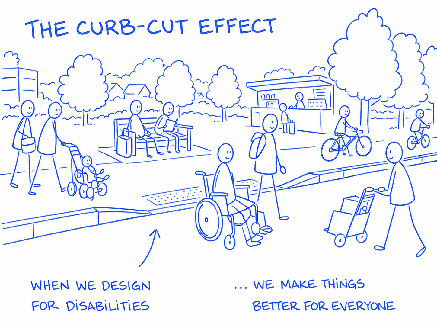
The business case is not separate from the human case. Accessible products tend to be clearer, easier to navigate, better structured, and more resilient. That benefits disabled people first, but it often improves the experience for everyone else too. This is the curb-cut effect in digital form: the thing designed to remove a barrier for one group becomes useful to many others.
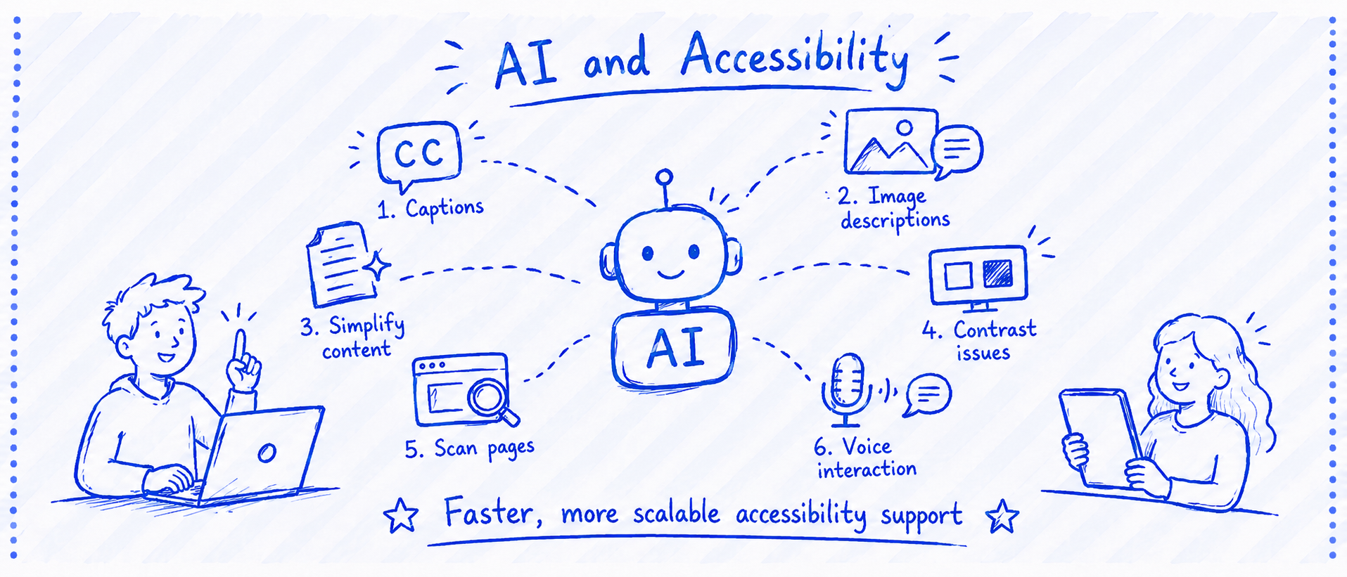
AI is changing the accessibility conversation too. It can help generate captions, draft image descriptions, simplify content, identify contrast issues, scan pages, and support voice interaction. Used well, AI can make accessibility work faster and more scalable.
But AI is not a replacement for accessibility expertise or disabled-user testing. Automated tools still miss important issues, especially around keyboard navigation, screen reader behaviour, interaction design, task completion, context, and whether an experience actually makes sense to the people using it. The best use of AI is as an assistant: useful for speed, coverage, and first-pass checks, but not a substitute for human judgement.
Accessibility becomes much easier when it moves upstream. Designers can specify focus states, contrast, target sizes, form behaviour, error handling, heading structure, and interaction alternatives before development begins. Content designers can write clearer labels, instructions, links, and alt text. Developers can build semantic structure and test with assistive technologies. Product teams can include disabled users in research rather than making assumptions about their needs.
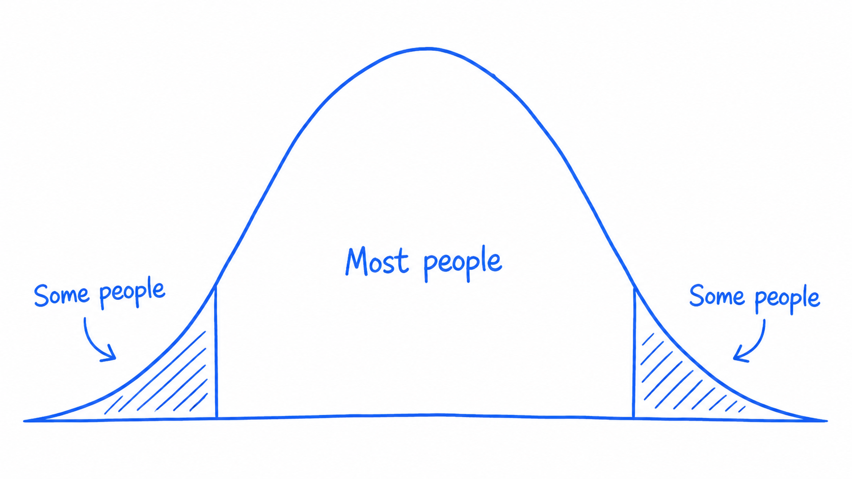
The goal is not to design for an abstract average user. There is no average user. People use products with different abilities, devices, environments, levels of confidence, and moments of stress. When teams design only for the middle, they exclude the edges. When they design for the edges, the middle usually becomes easier too.
Design for the edges, you get the middle for free.